Before you can improve your website's conversion rate, you have to figure out what's broken. It's all about playing detective: digging into your analytics to see where people are leaving, mapping out your conversion funnel to find the friction points, and using tools like heatmaps to understand why visitors aren't clicking that "buy now" button.
Find Your Conversion Roadblocks First
So many people jump straight into A/B testing button colors or rewriting headlines. That's a classic mistake. It's like trying to fix a car engine without ever popping the hood. The most effective way to actually improve your website's conversion rate is to start with a thorough diagnosis. You need to put on your detective hat and find the exact spots where potential customers are getting stuck, confused, or just plain frustrated.
This whole diagnostic phase isn't about chasing vanity metrics like total traffic. It's about getting inside your users' heads, understanding their behavior, and identifying the critical roadblocks in their journey. This is foundational for SEO—understanding user intent and satisfaction is key to ranking. Without this initial deep dive, any changes you make are just shots in the dark.
Conduct a Practical Analytics Audit
Your analytics platform, whether it's Google Analytics or something else, is your ground zero for clues. It holds the key to understanding where your conversion funnel is leaking cash. Instead of getting buried in data, just focus on a few key areas to pull out insights you can actually use. This process is a core part of any real digital marketing audit and gives you a clear, honest picture of what’s really happening on your site.
Start by looking at:
- High-Exit Pages: Pinpoint the exact pages where a huge chunk of your users decide to leave. Is it a specific product page? A particular step in your checkout process? Maybe a confusing form? A high exit rate on a page that should be leading to a conversion is a massive red flag for both user experience and your SEO rankings.
- Funnel Drop-Off Points: If you have goal funnels set up, this is gold. Where are the biggest drop-offs happening? Are people adding items to their cart but never even starting the checkout? Or are they bailing on the shipping information page? This tells you exactly where to focus your firepower.
- New vs. Returning User Behavior: Take a look at the conversion rates for new visitors versus returning ones. If your returning users are converting at a much higher rate, it could mean your initial value proposition—your story—isn't hitting home for first-timers.
Analyze Your Traffic Sources
Let's be real: not all traffic is created equal. You need to know which channels are bringing you engaged visitors who are ready to convert. This is crucial for both your SEO and paid ad strategies. For example, the global average ecommerce conversion rate hovers between 2.5% and 3%, but that number swings wildly depending on where the traffic came from.
Referral traffic, for instance, often converts at an impressive 5.4%, while social media traffic can lag way behind at just 0.7%. By digging into your sources, you can double down on the channels that deliver users who are ready to take action.
To help you get a clearer picture, here’s a breakdown of what you can typically expect from different traffic sources.
Traffic Source Conversion Benchmarks
This table breaks down average conversion rates to help you see where your marketing and optimization efforts might have the biggest impact.
| Traffic Source | Average Conversion Rate | Actionable Insight |
|---|---|---|
| Referral | 5.4% | High-intent traffic. Prioritize getting links and mentions on relevant, high-authority sites in your niche. |
| 3.6% | Your warmest audience. Focus on segmentation and personalized offers to nurture these leads effectively. | |
| Paid Search | 2.9% | Users are actively looking for a solution. Optimize landing pages and ad copy to match search intent perfectly. |
| Organic Search | 2.8% | Strong indicator of brand trust and authority. Target long-tail keywords to attract users closer to conversion. |
| Direct | 2.2% | Often returning customers or those who know your brand. Ensure a seamless user experience for these loyal visitors. |
| Social Media | 0.7% | Generally low-intent, top-of-funnel traffic. Use social for brand awareness, not hard sells. Focus on retargeting. |
Knowing these benchmarks helps you spot opportunities. If your paid search is converting at 1%, you know there's a disconnect between your ad and your landing page that needs fixing.

This kind of funnel analysis immediately flags where users are dropping off. The data might show a huge leak between the 'Add to Cart' and 'Begin Checkout' stages, pointing directly to a problem with the cart page itself.
Go Beyond Numbers with Qualitative Data
Analytics tells you what is happening. Qualitative tools tell you why. This is where you get to the human side of the equation and really start to understand the user experience. This is where Answer Engine Optimization (AEO) begins—by understanding the 'why' behind user questions.
The secret to conversion rate optimization isn't just about tweaking elements; it's about developing empathy for your users. You need to see your website through their eyes to understand their frustrations and motivations.
Tools like heatmaps and session recordings are perfect for this.
- Heatmaps from tools like Hotjar or Crazy Egg show you exactly where users click, how they move their mouse, and how far down the page they scroll. A heatmap might reveal that everyone is trying to click on a non-clickable image, which is an immediate, easy design fix.
- Session Recordings are literal videos of real user sessions on your site. Watching these is often an eye-opening, and sometimes painful, experience. You might see a local landscaping client (GEO targeting opportunity) struggling repeatedly with your clunky quote form or an e-commerce customer hitting a hidden bug in the shipping calculator.
When you combine the hard numbers from analytics with these real-world qualitative insights, you build a powerful, data-backed list of your biggest conversion blockers. This list becomes your roadmap for targeted, high-impact optimization—no more guessing required.
Master Website Speed and Core Vitals
Once you've mapped out the leaks in your conversion funnel, it's time to pop the hood and look at your site's technical guts. You can have the most persuasive copy and a killer design, but it’s all wasted if your page takes an eternity to load.
In the world of CRO and SEO, speed isn't just a nice-to-have feature. It’s the foundation. A slow website is like a shop with a door that's jammed shut. It doesn't matter how great the stuff is inside; most people will just give up and leave. That initial friction costs you rankings and sales before a visitor even sees what you're selling.

Why Core Web Vitals Are Really Conversion Metrics
Google has been shouting from the rooftops that user experience is a top priority, and they measure it with a set of metrics called Core Web Vitals. Don't let the name fool you—these aren't just technical fluff for your developers. They are direct indicators of how a real person experiences your site.
Think of them this way:
- Largest Contentful Paint (LCP): How long does it take for the most important thing on the page (like the main image or headline) to show up? A fast LCP tells visitors, "Hey, this page is working!"
- First Input Delay (FID): How quickly does your site react when someone clicks a button or a link for the first time? A slow FID feels laggy and broken, instantly killing confidence.
- Cumulative Layout Shift (CLS): Ever try to click something, only for an ad to load and push it down, making you click the wrong thing? That’s layout shift. CLS measures how much your page elements jump around while loading.
These vitals don't just affect your conversion rate; they also have a direct impact on your SEO performance. Google uses them as a ranking signal, so a poor score can tank your visibility in search results, making it that much harder for new customers to find you.
High-Impact Fixes You Can Tackle Now
Improving your site speed doesn't have to mean a six-month development project. Often, a few smart, targeted fixes can deliver massive gains. I once worked with a small ecommerce startup that saw its mobile conversions literally double in a week. Their big secret? They compressed their product images. That's it. A fix that took their team less than a day.
Here are a few practical actions you can take right away:
- Crush Your Images: Huge, unoptimized images are the number one cause of slow websites. Use a tool like TinyPNG or ImageOptim to slash file sizes without making your photos look grainy.
- Use Browser Caching: Caching tells a visitor's browser to save parts of your site (like your logo and CSS files). When they come back, the page loads almost instantly because their computer already has most of the files.
- Get Better Hosting: That cheap, shared hosting plan might seem like a good deal, but it's a classic case of false economy. If your site is sluggish, upgrading your hosting plan can provide an immediate, dramatic speed boost.
You don’t have to guess where the problems are. Just run your site through Google's free PageSpeed Insights tool.
It gives you a clear performance score and a prioritized list of what's slowing you down on both mobile and desktop. It’s like a diagnostic report from a mechanic, telling you exactly what needs fixing.
The link between speed and sales is undeniable. The data shows sites loading in just 1 second can have conversion rates up to 5 times higher than those taking 10 seconds.
Even a tiny improvement pays dividends. Shaving just 1 second off your load time can lift conversions by 2%. Considering mobile conversion rates (around 2-3.4%) typically trail desktop (3.4-6%)—often due to slower connections—optimizing for speed is one of the most direct paths to capturing more revenue. If you want to dive deeper, you can check out more ecommerce conversion benchmarks to see how you stack up.
Build Trust with Social Proof and A/B Testing
Okay, so your site is lightning-fast and you've mapped out exactly where users are dropping off. Now it's time to focus on the human element: trust.
No matter how slick your product is, a user who feels uncertain isn't going to convert. Your job is to systematically dismantle that doubt and turn skepticism into confidence. This is where the one-two punch of smart social proof and methodical A/B testing comes in. It’s how you stop guessing and start making data-backed decisions that actually persuade people to act.

Go Beyond Generic Testimonials
Slapping a few quotes on your homepage is a start, but it's not a real strategy. Effective social proof is all about putting the right validation in front of the right person at the exact moment they need it most. It's about showing, not just telling.
Think about a local plumber trying to land a new client. Instead of a generic quote, what if they showed before-and-after photos of a recent job right on their "Clogged Drain Repair in [City Name]" service page? That visual proof is immediate, relevant, and way more powerful than a simple text review. It tells a local story that hits home with customers in that specific area, boosting your local search ranking (GEO).
To make this work for you:
- Context is Everything: Place reviews where they matter most. A glowing testimonial about your customer service belongs on the pricing or checkout page—right where a user might be getting cold feet about post-purchase support.
- Mix It Up: Don't just rely on text. Use user-submitted photos, short video testimonials, "as seen on" logos from local news outlets, or even screenshots of positive social media comments.
- Show the Numbers: "Great service" is forgettable. "Helped Client X increase their local leads by 45% in three months" is a concrete result that builds instant credibility.
This isn't just theory; the data backs it up. Websites that feature User-Generated Content (UGC) see conversion rates jump by a staggering 102% when visitors engage with it. Combine that with disciplined A/B testing—which can lift landing page conversions by an average of 12%—and you have a serious CRO engine. In some competitive industries, lead-gen pages have hit conversion rates as high as 19% using these exact methods. You can dig into more of these stats over at WordStream.
Your First Meaningful A/B Test
Once you’ve layered in some powerful social proof, it's time to start testing. A/B testing is how you scientifically improve your conversion rates, ditching personal bias and letting real user data call the shots. The trick is to avoid random tests and focus on strong, clear hypotheses.
A great A/B test doesn't start with, "I wonder if a green button is better?" It starts with, "I believe changing the button text from 'Submit' to 'Get My Free Quote' will increase form fills because it emphasizes value over action."
See the difference? That hypothesis is specific, measurable, and tied directly to a user's motivation. It gives your test a real purpose.
You don't need a suite of expensive tools to get started. Platforms like the new Google Analytics 4 testing features or VWO offer accessible ways to run your first experiments. The goal is simple: isolate a single variable and test it against the original.
For a local service business, you might test a headline emphasizing "Same-Day Service in [Your Town]" against one that highlights "Affordable Rates for [Your County]." For an ecommerce store, you could test product descriptions that tell a compelling story versus a simple bulleted list of features.
Here's a simple framework to help you structure your hypotheses and get clear results.
A/B Testing Hypothesis Template
A simple framework to structure your A/B tests for clear, actionable results.
| Hypothesis Component | Example for a Local Service Business | Example for an Ecommerce Store |
|---|---|---|
| The Change | Changing the CTA button from "Contact Us" to "Get Your Free Estimate" | Replacing lifestyle product photos with images showing product details up close |
| The Expected Outcome | increase form submissions | increase "Add to Cart" clicks |
| The Rationale | because it reduces commitment anxiety and clarifies the immediate value for the user. | because shoppers are more concerned with quality and features than brand image. |
Once you've set up your test, let it run until it reaches statistical significance—this usually means collecting enough data over a couple of weeks to be confident in the results. When you have a clear winner, implement the change and move on to your next hypothesis.
This cycle—building trust with social proof and then validating your ideas with A/B testing—is the engine that will drive sustainable growth for your business.
Fine-Tuning Your Copy, Forms, and Checkout
Now that you've got trust signals in place and a testing framework ready to go, it's time to zero in on the make-or-break moments in the user's journey. I'm talking about the exact points where a browser becomes a buyer.
This is where your copywriting, your forms, and your checkout flow can either lock in the sale or send a motivated customer scrambling for the exit. This is where great storytelling transforms a visitor into a customer and where a clean user experience boosts your SEO.
Think of it like this: your copy tells the story, your forms are the handshake, and your checkout is the final signature on the deal. Every single element needs to be smooth, persuasive, and completely in sync with what your customer expects.
Write Copy That Solves a Problem
The single biggest mistake businesses make with their website copy is talking about themselves. It’s all features, company history, and jargon-filled nonsense. Here's a hard truth: your customer doesn't care about your features; they care about their own problems.
Great copy flips the script and positions your product or service as the solution they've been looking for. Don't just say, "We offer premium HVAC filters." Instead, try: "Breathe cleaner air in your [City] home and slash your energy bills." The second one hits home because it speaks directly to the customer's real desires—better health and more money in their pocket. It makes them the hero of the story.
To get this right, you need to:
- Focus on Benefits, Not Features: A feature is what something is (like a 10,000 mAh battery). A benefit is what it does for the user ("Stay connected all day without a single worry about your phone dying").
- Speak Their Language: Dive into your customer reviews, surveys, and support emails. How do they talk about their pain points? Use their exact phrases in your headlines and product descriptions. This is direct fuel for Answer Engine Optimization (AEO).
- Tell a Story: Your product isn't just a thing; it's the tool that helps your customer conquer a challenge. For a local roofer, the story isn't about shingles; it's about protecting a [Town Name] family's home from the next big storm.
This shift in perspective is the secret to writing words that actually sell. If you don't consider yourself a writer, there are great guides on how to create web content for your business that truly connects with an audience.
Cut the Friction From Your Forms
Forms are where conversions go to die. Every single field you add is another hurdle, another reason for a user to get annoyed and just leave. In fact, a staggering 27% of users will abandon a form simply because it’s too long or confusing. Your goal is to make it feel effortless.
Just look at Expedia. They famously boosted their profits by $12 million a year just by removing one unnecessary field from their booking form. That's the incredible power of keeping things simple.
Your forms should feel like a quick, easy conversation, not an interrogation. Only ask for what is absolutely necessary to complete the current step.
Here are some quick wins you can implement today:
- Kill Optional Fields: If a piece of info isn't critical right now, get rid of it. You can always ask for it later.
- Use Obvious Labels: This isn't the time to be clever. "Full Name" works way better than "Your Moniker."
- Add Social Logins: Letting people sign up or log in with Google or Facebook can slash form-filling time and dramatically increase completions.
- Auto-fill Everything Possible: Use tools that automatically populate address information. The less typing, the better.
Deconstruct and Streamline Your Checkout
The checkout is the final boss battle. Your customer is highly motivated at this stage, but they're also on high alert for friction or last-minute surprises. This is where you need to project maximum trust and transparency.
I once worked with an online clothing store that was seeing a huge cart abandonment rate on mobile. We redesigned their checkout into a simple, three-step accordion view and made the "Guest Checkout" button impossible to miss. The result? A 15% jump in mobile conversions in under a month.
To bulletproof your checkout flow:
- Always Offer Guest Checkout: Forcing users to create an account is one of the biggest conversion killers, period. Make the guest option the easiest path forward.
- Show All Costs Upfront: Nobody likes being ambushed by unexpected shipping fees or taxes on the final screen. Display the all-in cost in the shopping cart.
- Use a Progress Bar: Let people know where they are in the process (e.g., "Step 2 of 3"). It manages expectations and reduces the anxiety of the unknown.
- Display Trust Seals Prominently: Show off security logos (like your SSL certificate) and the payment methods you accept (Visa, PayPal, etc.) to reassure shoppers their data is safe.
If you want to find the hidden snags in your own checkout, using a dedicated survey template to rate checkout experience is a game-changer. This kind of direct feedback will uncover frustrations that you'd never spot in your analytics alone.
Create Your Own Testing Roadmap
All the theory and tactics in the world won't move the needle without consistent, focused action. This is where the rubber meets the road—where you stop reading about conversion rate optimization and actually start doing it. Building a testing roadmap is how you turn all those insights you've gathered into a structured plan for growth.
Don't think of it as some rigid, overly complicated document. It's more of a living guide. Its job is to prioritize your tests, help you snag some early wins, and build momentum. A roadmap ensures your efforts are strategic instead of just random shots in the dark, focusing your limited time and resources on what's most likely to pay off.
Prioritize Based on Impact and Effort
A solid roadmap lives and dies by smart prioritization. Let's be real: not all tests are created equal. Tweaking a headline is a world away from redesigning your entire checkout flow. You need a simple way to balance the potential reward of a test against the resources it'll take to get it live.
A simple but incredibly effective framework for this is the ICE score, which stands for Impact, Confidence, and Ease.
- Impact: How big of a lift do you honestly think this change will have on your conversion rate? (Score 1-10)
- Confidence: Based on your data and research, how sure are you that this change will actually work? (Score 1-10)
- Ease: How simple will this be to implement from a technical and logistical standpoint? (Score 1-10)
Just multiply those three scores. The resulting number gives you a clear way to stack-rank your ideas. Tests with the highest scores go right to the top of your to-do list.
Roadmaps for Different Business Types
Your roadmap needs to be tailored to your specific business. A one-size-fits-all approach is a recipe for wasted effort. The conversion goals for a local plumber are fundamentally different from those of a national e-commerce brand, and your plan should reflect that.
For Local Service Providers (Plumbers, Roofers, Dentists)
For any local business, the name of the game is generating qualified leads. Your roadmap should be laser-focused on building trust and making it ridiculously easy for a potential customer to reach out. This is where GEO and local SEO meet conversion.
- Top Priority: Zero in on your main contact or quote form. A/B test the number of fields, experiment with CTA text ("Get a Free Quote" vs. "Schedule Service"), and try placing trust signals like "Licensed & Insured" badges right next to the form.
- Next Steps: Make your location-specific testimonials impossible to miss. Test adding a map of your service area to the homepage to instantly build local credibility (GEO). Tell stories of local jobs you've completed.
- Later On: Experiment with a "sticky" click-to-call button that's always visible on mobile devices.
This flow is critical. You attract visitors with great copy, engage them with a simple form, and then convert them.
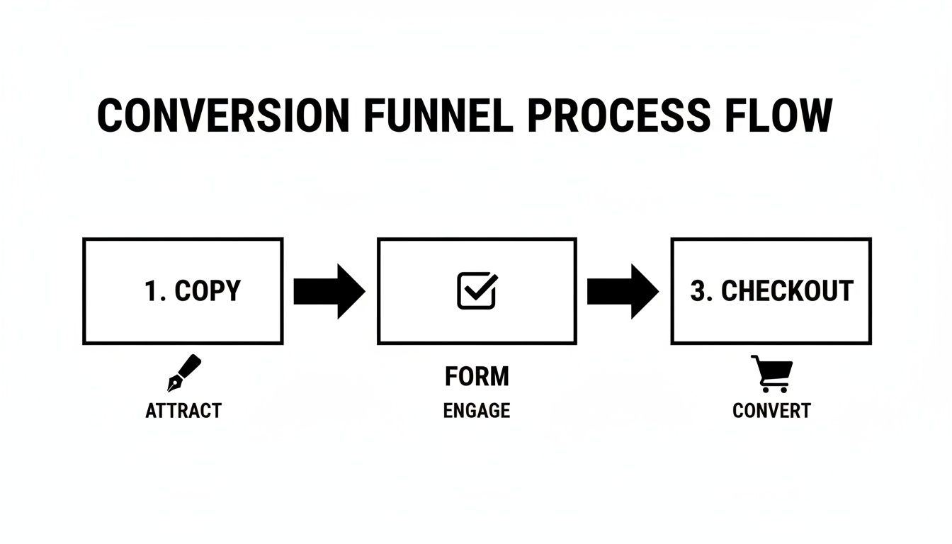
Every step is a potential drop-off point, which is exactly why your roadmap needs to address each stage to improve your overall conversion rate.
For E-commerce Stores
E-commerce success is all about a smooth, trustworthy path from browsing to buying. Your roadmap should be all about removing friction from that journey and telling compelling product stories.
- Top Priority: Streamline your mobile checkout. Test a single-page checkout against a multi-step accordion style. Make guest checkout the most obvious and appealing option.
- Next Steps: Test different promotional offers directly on product pages. Does "15% Off" pull better than "Free Shipping"? How does adding a countdown timer to a sale impact your add-to-cart rate?
- Later On: Play around with product recommendation engines. Test different algorithms (like "Customers Also Bought" vs. "Frequently Bought Together") to see which one drives a higher average order value.
A great testing roadmap doesn't just list ideas; it tells a story of continuous improvement. It shows how you're systematically addressing user friction, building on what you learn, and making data-driven decisions that lead to sustainable growth.
Building this roadmap gets your whole team on the same page about what you're testing, why you're testing it, and what success looks like. It turns CRO from a one-off project into a core part of how you do business.
Of course, understanding your customer acquisition channels is key. For a deeper dive, you can learn more about linking your analytics and paid search efforts to see how different traffic sources behave. That data can directly inform which tests you should prioritize for the biggest impact.
Your Top CRO Questions, Answered
Jumping into conversion rate optimization always kicks up a few key questions. I've heard them from dozens of clients, whether they're focused on local SEO (GEO), e-commerce, or just building their brand's authority.
Let's clear the air and tackle some of the most common things business owners and marketers ask when they're figuring out how to get more out of their website traffic.
How Long Until I Actually See Results?
This is the big one, and the honest answer is: it depends. A simple, glaring fix—like a broken checkout button or a major typo in a headline—can give you a noticeable lift in just a few days.
But for most real A/B tests, you have to play the long game. It usually takes a solid two to four weeks to collect enough clean data for a result to be statistically significant. If you rush it, you're just making decisions based on random noise, not actual user behavior.
Think of CRO as a continuous improvement cycle, not a one-and-done project. With consistent effort, you'll start to see those compounding gains pile up within three to six months.
What’s a “Good” Conversion Rate, Anyway?
There's no magic number here, and anyone who gives you one is oversimplifying things. Sure, you'll see the global e-commerce average floating around 2.5-3%, but that figure can be totally misleading.
A local service business (GEO) might have a higher conversion rate goal for phone calls than a national brand. A B2B site generating leads might be thrilled with 10%, while a massive content site with millions of visitors could see 1% as a huge win. For a deeper dive on this, check out this complete guide on how to increase conversion rate.
Instead of chasing a generic average, focus on two things: your direct industry competitors and, more importantly, your own past performance. Setting a goal to get a 20% lift on your current conversion rate is a much smarter, more actionable target.
Do I Really Need to Buy Expensive Tools to Start?
Absolutely not. In fact, starting with the basics is the smartest way to go. You can get an incredible amount of work done with a powerful suite of free tools.
- Google Analytics is the non-negotiable foundation. It's how you'll understand what users are doing and track your conversions.
- Google PageSpeed Insights gives you a free, crystal-clear report card on what's slowing your site down.
- Microsoft Clarity or Hotjar both offer generous free plans for heatmaps and session recordings. These are like watching over your user's shoulder to see exactly where they get stuck.
Get comfortable with these tools first. They provide more than enough ammunition to launch a successful SEO and CRO program before you ever need to think about dropping money on pricier platforms.
At Jackson Digital, we turn these insights into measurable growth for businesses like yours. If you're ready to stop guessing and start making data-driven decisions that boost your bottom line, let's talk. Request a free performance audit today.