Improving your website's conversion rate isn't some dark art. It’s about creating a seamless journey from search to sale. You use SEO, GEO, and AEO to attract the right people with a compelling story, and then you make it incredibly easy for them to take the next step. You're turning visitors into customers by systematically knocking down any barriers and making your value crystal clear.
The goal is to make saying "yes" the easiest possible decision.
Building Your Foundation for Higher Conversions

Before you start dreaming of doubling your conversions, you have to get the foundation right. This isn't about isolated tactics like changing button colors. It's about seeing the whole picture. Optimizing for conversions is the final, crucial handoff in a journey that starts way back in a search bar, where your brand's story first begins.
Your search engine optimization (SEO), local search (GEO), and answer engine optimization (AEO) efforts are what bring people to your digital doorstep. But are they the right people? This is the first, non-negotiable step. Attracting high-intent visitors—people actively looking for a solution you provide—is everything. A site with 10,000 visitors just looking for free info will convert at a fraction of the rate of a site with 1,000 visitors ready to buy.
Connecting Search Intent to Conversion
Think of it like this: your brand's story, told through your content, sets an expectation. When someone clicks from Google, they're expecting that story to continue seamlessly on your landing page. If there's a disconnect—a jarring change in tone, message, or offer—they're gone. This is where so many businesses stumble.
- SEO (Search Engine Optimization): This is how you rank your business on search engines by answering questions and solving problems. If someone searches for "emergency roof repair," your page had better rank for that term and instantly deliver a story of urgency and reliability.
- GEO (Geographic Optimization): This is all about capturing local intent so you rank in your service area. A search like "plumber near me" signals a problem that needs fixing now. Your site has to make it dead simple to call or book, proving you're the local, trusted expert.
- AEO (Answer Engine Optimization & Storytelling): This is where you build trust and authority. Your content shouldn't just rank; it needs to tell a compelling story about why you're the best choice. It’s about answering questions before they’re even asked and positioning your business as the definitive solution.
The most effective conversion strategies are built on a deep understanding of the visitor's journey. You must align what you promise in search results with the experience you deliver on your website.
Setting Realistic Benchmarks
So, what’s a "good" conversion rate? Honestly, the answer is different for everyone. It's completely dependent on your industry. Forget chasing some universal number. Instead, figure out your baseline and just aim for steady, consistent improvement.
Here are some real-world ballpark figures:
- Local Services (e.g., Roofing, Plumbing): A conversion is usually a phone call or a quote request form. Rates can be all over the place, but if you're hitting 5-10% from qualified local traffic, you're doing great.
- Ecommerce: The global average here is about 2-3%. That's a completed purchase. A small jump from 2% to 2.5% might not sound like much, but it's a massive 25% increase in sales.
- SaaS: For software companies, a conversion is typically a free trial sign-up or a demo request. You'll often see benchmarks from 2% to 7%, depending on how complex and expensive the software is.
If you really want to build a solid foundation, getting familiar with a proven CRO framework for increasing website conversion rate is a great place to start.
Your First Step: A Baseline Audit
Let’s walk through a real-world scenario. A local roofing company in Miami ranks pretty well on Google for "roof repair Miami" (solid GEO), but their lead flow is pathetic. They decide to run a baseline audit, using nothing more than free tools like Google Analytics.
The "aha!" moment comes quickly. They see that 80% of their traffic is on mobile, but their mobile bounce rate is a sky-high 90%. Yikes. They dig a little deeper and find the culprit: their "Get a Free Quote" form is a total disaster on a phone. The fields are tiny, it's spread across multiple pages, and there isn't even a click-to-call button.
People are showing up with high intent, ready to solve a problem, but they hit a wall of frustration and leave. The story promised by their high search ranking—"we are the best roofer in Miami"—fell apart at the final step.
This isn't a traffic problem; it's a conversion problem caused by a terrible user experience. By finding this one major leak, the company now has a clear, high-impact place to start fixing things. This initial diagnostic work is absolutely critical, and if you need help with the content side of things, our article on how to create great web content for your business has some useful tips. This audit is the launchpad for every successful optimization effort that follows.
Finding the Leaks in Your Conversion Funnel
Before you can start boosting your website's conversion rates, you have to play detective. It's not enough to know what's happening; you need to find the exact spots where potential customers are hitting a wall and leaving so you can figure out why.
Think of it like a brick-and-mortar store. Your standard analytics might tell you 100 people walked in, but only two bought anything. That’s a start, but what happened to the other 98? Did they get lost looking for the right aisle? Was the checkout line a nightmare? To get those answers, you’d have to actually watch them shop.
That’s exactly what modern user behavior tools let you do, but for your website.
Going Beyond Basic Analytics
This is where you move past simple traffic numbers and dig into the real user experience. Tools that show you heatmaps and session recordings are your secret weapons for finding conversion killers. They give you a visual story of what people are actually doing on your site.
- Heatmaps: These paint a picture of where users are clicking, how they're moving their mouse, and—crucially—how far down the page they're scrolling. A heatmap might show everyone clicking on a fancy image that isn't actually a button, or it might reveal that your main call-to-action is buried below the fold where nobody ever sees it.
- Session Recordings: This is the closest you can get to looking over a user's shoulder. You can watch anonymous recordings of real visitors as they try to navigate your site. You'll see where they hesitate, where they get stuck in a frustrating loop, and the exact moment they give up.
The most powerful insights don't come from spreadsheets. They come from seeing your own website through your users' eyes. Data tells you where the drop-off is; session recordings show you the frustration that caused it.
A thorough diagnostic audit is the foundation of any serious CRO strategy. Our guide on how to conduct comprehensive digital marketing audits can give you a solid framework for this process.
A Real-World Example From a Dental Practice
Here’s a story from a local dental practice we worked with. Their local SEO was great, pulling in tons of traffic for keywords like "dentist in Brooklyn." Analytics showed people were landing on the "Book an Appointment" page but then just disappearing. The numbers simply didn't add up.
After watching just a few session recordings, the problem became painfully obvious. Their online form was a beast. It demanded detailed insurance information right away, asking for group numbers and policy IDs. You could literally watch people start filling it out, get confused or annoyed, and then just bail. They weren't ready to go hunt for their insurance card; they just wanted to schedule a cleaning. Their online story shifted from "we make dental care easy" to "give us your complicated paperwork," and it killed conversions.
So, the practice tested a much simpler form that only asked for a name, phone number, and preferred time slot. The result? Appointment bookings more than doubled in one month. They found the leak and plugged it by simply making life easier for their visitors.
Prioritizing Your Audit Checklist
To find your own leaks, you need a system. Your audit should zero in on the biggest potential sources of friction—the things most likely to be costing you conversions right now.
Key Areas to Investigate
- Form Abandonment: Are your forms too long? Are you asking for sensitive info way too early in the relationship?
- Navigation Issues: Can people find what they're looking for easily? Are your main services and contact info obvious?
- Mobile Experience: How does the site actually work on a phone? Are the buttons big enough to tap? Is the text readable without pinching and zooming?
- Website Speed: This is a silent conversion killer. Page speed is a huge driver for improving conversion rates. Even a one-second delay can slash conversions by 7% and send bounces skyrocketing by 90%. Slow sites cost retailers $2.6 billion a year. For a local service provider, that delay means a potential customer with an emergency just called your competitor instead. You can find more insights about average website conversion rates on roastmyweb.com.
When you combine the hard numbers from your analytics with the human story from user behavior tools, you stop guessing. You transform a long list of potential problems into a clear, prioritized roadmap of what to fix first for the biggest impact.
Designing High-Impact CRO Experiments
Okay, you've done the digging and found the friction points on your site. Now comes the fun part: moving from diagnosis to action. This is where we stop staring at data and start architecting smart, systematic tests to turn those insights into real, measurable growth.
Forget about massive, sweeping redesigns. Effective CRO is all about a disciplined process. It's about testing specific, data-backed ideas, not throwing spaghetti at the wall to see what sticks. You’re not guessing; you're building a repeatable playbook for improvement, one test at a time.
From Hypothesis to Actionable Test
Every solid experiment begins with a strong hypothesis, and that hypothesis has to be rooted in a real problem you've uncovered. For example, if your heatmaps show everyone ignoring your main call-to-action button, your hypothesis isn't just "make the button better." That's too vague.
We need to get specific. A much stronger hypothesis would be: "Changing the CTA button text from 'Learn More' to 'Get Your Free Estimate' will increase clicks by 15% because the new copy is more specific and speaks directly to the user's immediate goal." See the difference? Now you have a clear variable to test and a concrete metric for success.
This logic works in any industry:
- For a local auto shop: You could test "Get a Free Estimate" against "Schedule Service Now." One is a low-commitment inquiry, while the other is a firm booking. The winner tells you a lot about your customers' intent when they land on your site.
- For a SaaS startup: On the pricing page, you might test a super-simple, streamlined layout against a detailed feature-comparison grid. This will show you whether your audience craves simplicity or needs every last detail before they'll convert.
A Simple Framework for Prioritizing Your Ideas
Chances are, you now have a laundry list of test ideas. So, where do you start? Trying to do everything at once is a surefire way to get overwhelmed and achieve nothing. You need a simple system to decide which tests will give you the biggest wins, the fastest.
This is where a battle-tested method like the ICE framework comes in.
ICE Scoring
- Impact: If this test is a winner, how big of an impact will it have on my main conversion goal? (1-10)
- Confidence: Based on the data I have, how sure am I that this will actually work? (1-10)
- Ease: How difficult is this to implement, both technically and in terms of resources? (1-10)
You just score each idea on these three criteria, then average the scores. The ideas with the highest ICE scores jump to the top of your to-do list. It’s simple math that forces you to be brutally honest about balancing potential rewards with the required effort.
Here's how to think about this entire process visually, moving from raw data to a prioritized action plan.
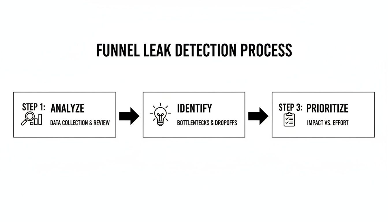
This workflow is the heart of CRO. You analyze what users are actually doing, pinpoint where they're getting stuck, and then prioritize your solutions before you ever write a line of code.
Here's how that might look in a simple table.
CRO Prioritization Framework Example (ICE Score)
Use this simple framework to score and prioritize your optimization ideas. Rate each idea from 1-10 for Impact, Confidence, and Ease, then average the scores to determine what to tackle first.
| Optimization Idea | Impact (1-10) | Confidence (1-10) | Ease (1-10) | ICE Score (Average) |
|---|---|---|---|---|
| Change homepage CTA from "Learn More" to "Get a Quote" | 8 | 9 | 9 | 8.7 |
| Redesign the entire checkout process | 10 | 7 | 3 | 6.7 |
| Add customer testimonials to the pricing page | 7 | 8 | 8 | 7.7 |
| Test a simplified navigation menu | 6 | 5 | 6 | 5.7 |
In this example, changing the homepage CTA is the clear winner—it offers high impact and confidence with minimal effort. The full checkout redesign, while potentially huge, is a much bigger project and gets pushed down the list for now. This keeps your team focused on what matters most.
Key Areas for High-Impact Experiments
While your own data is always your best guide, some parts of a website almost always offer big opportunities for testing. These are the levers that tend to have an outsized effect on improving website conversion rates.
Headlines and Value Propositions
Your headline has about three seconds to do its job. It's the first thing people read, and it has to convince them to stick around. A great headline doesn't just describe what you do; it screams the value you provide and the problem you solve. This is a critical piece of your AEO strategy—it's the first line of your story.
- Test this: A benefit-driven headline ("Get a Flawless Roof That Lasts a Lifetime") vs. a feature-driven one ("We Offer Shingle, Metal, and Tile Roofing").
Landing Page Layout and Flow
The structure of your page is the path you lay out for your user. A cluttered, confusing layout with too many competing calls-to-action just creates decision fatigue. Your job is to simplify that path, remove the distractions, and create a clean, logical flow that leads the user right where you want them to go.
- Test this: A clean, single-column layout with one obvious CTA vs. a multi-column design that presents several different offers.
Form and Checkout Simplification
Long, complicated forms are absolute conversion killers. Every single field is another chance for a user to give up and leave. You have to challenge every field you ask for: is this information absolutely critical to collect right now?
For ecommerce sites, a painful checkout is a guaranteed way to lose money. Just offering a guest checkout option can slash cart abandonment by 10-30%.
- Test this: A simple, single-step checkout process vs. a multi-step flow that uses a progress bar to show users how close they are to the finish line.
By focusing your experiments on these critical areas and using a simple framework like ICE to prioritize, you stop making random tweaks. You start building a methodical, repeatable engine for growth that turns your hard-earned traffic into tangible results.
Optimizing for Local and Mobile Conversions

Let's be real: your customers aren't chained to a desk. They're on their phones, looking for solutions while waiting for coffee, sitting in traffic, or lounging on the couch. For any local service business or modern ecommerce store, the mobile experience isn't an afterthought—it's the whole game. This is where conversions are won or lost.
This simple fact completely changes how we approach conversion optimization. A site that looks slick on a big monitor can be a frustrating, conversion-killing disaster on a five-inch screen. This is why a mobile-first design philosophy isn't just a buzzword; it's essential. It means you stop shrinking your desktop site and start building the user journey from the ground up, specifically for a mobile user.
Tapping into Local Search Intent
The power of mobile gets supercharged when you throw local search into the mix. Think about the urgency behind a search like "emergency plumber near me" or "dentist open now." These aren't casual browsers. They're high-intent customers with a problem that needs solving, right now. Your local SEO (GEO) gets you in front of them, but it’s your mobile site that has to close the deal.
To capture that urgent intent, your site needs to deliver immediate, frictionless answers:
- One-Tap Contact: Your phone number absolutely must be a clickable "tel:" link, and it should be impossible to miss. Nobody is going to copy and paste a number from their browser into their phone dialer. Make it easy.
- Clear Address & Map: An embedded, interactive map and a clean, visible address are non-negotiable for driving foot traffic.
- Quick Service Info: Mobile users scan; they don't read novels. Use bullet points, bold text, and accordions to lay out your services clearly and quickly.
This is how you connect with a local audience. By making it absurdly simple for a stressed-out homeowner to call you about a leaking pipe, you’re not just a service provider—you're the fast, reliable solution they desperately needed. Your site's story becomes one of immediate help.
What a High-Converting Mobile Experience Actually Looks Like
A great mobile experience feels effortless. It anticipates what the user needs and bulldozes every possible point of friction out of their way, guiding them smoothly toward conversion. This goes way beyond aesthetics; it's about smart, intuitive, functional design.
The global average e-commerce conversion rate is a modest 2.9%, but a bad mobile experience makes 53% of users bounce immediately. For local businesses like plumbers or dentists, a clunky site means losing leads from those critical "near me" searches every single day. Responsive design and one-tap contact forms can turn those frantic searches into booked appointments. You can dig into more benchmarks and insights about conversion rates on dynamicyield.com.
Your mobile site's job is to close the distance between a user's problem and your solution as quickly as possible. Every extra tap, every confusing field, and every second of load time is a risk you can't afford to take.
A Tour Company’s Mobile Turnaround
I once worked with a small, local tour company. Their local SEO was solid—they ranked well for "city walking tours"—but their online bookings were completely flat. A quick audit showed us why: the mobile booking process was a nightmare. We’re talking a tiny calendar, multiple pages of forms, and a payment gateway that clearly wasn't designed for a thumb.
We decided to scrap it and start over with a mobile-first approach. Here’s what we did:
- Simplified the Booking Flow: We consolidated the entire booking process onto a single, streamlined page. No more endless "next" buttons.
- Used a Visual Calendar: We swapped the old one for a large, touch-friendly calendar that made picking a date a breeze.
- Added Mobile Payments: We integrated one-tap payment options like Apple Pay and Google Pay, removing the need to manually enter credit card details.
The results? Immediate and dramatic. Mobile bookings shot up by over 40% in the first two months. By simply smoothing out the user journey, they turned their strong search visibility into actual, measurable revenue. It was a perfect example of how optimizing the mobile experience is one of the most direct paths to growth.
Analyzing Results to Scale Your Success
Launching your A/B test isn’t the finish line—it’s just the start. The real engine for growth kicks in when you start digging into the results. This is where you go beyond a simple "win" or "loss" to understand the why behind your users' behavior, turning a one-off experiment into a system for repeatable success.
A test doesn't just give you a better-performing page; it hands you priceless intelligence about your audience. A successful test isn't just one that lifts conversions. Even a "failed" test that shows zero improvement is a huge win if you learn what your customers don't want.
Moving Beyond Surface-Level Metrics
It’s tempting to glance at a result, see a 5% lift in form fills, and call it a day. But the real story is almost always buried deeper. The trick is to analyze not just what happened, but who it happened to. This is where audience segmentation becomes your most powerful tool.
By slicing your test data, you can uncover surprising insights that a top-level view would have completely missed.
- Device Segmentation: Did your new, punchy headline absolutely kill it on mobile but actually perform worse on desktop? That’s a huge clue that mobile users crave speed and clarity, while desktop visitors might need more detail.
- Traffic Source Segmentation: Maybe your new value proposition resonates powerfully with visitors from paid search campaigns but falls completely flat with your organic crowd. This could signal a disconnect between your ad copy and your landing page story, a break in your SEO-to-conversion pipeline.
- New vs. Returning Visitors: A bold new offer might be a massive hit with first-timers but could just confuse loyal, returning customers who are used to seeing something else.
The most profound insights come from the nuances within your audience. A change that looks like a failure overall might actually be a massive success with a specific, high-value segment you can now target more effectively.
Interpreting the Why Behind the What
Once you've zeroed in on which segments responded best, the next job is to figure out why. This is where you blend the hard numbers from your test with the qualitative gold you've gathered from tools like heatmaps and session recordings.
Let's imagine a local service company tests a new, video-heavy landing page. The overall conversion rate doesn't move an inch. Disappointing, right? But when they segment the data, they see a 30% lift among mobile users who came from a specific Facebook ad campaign.
What's going on? They might hypothesize that the video's story and style perfectly matched the ad that brought them there, creating a seamless, compelling narrative. That single insight is far more valuable than the initial "flat" result. Understanding this connection is a core part of effective marketing analytics.
Rolling Out Winners and Documenting Everything
When a test produces a clear winner, the obvious next move is to roll it out to 100% of your audience. But don't pop the champagne just yet. The final, and arguably most important, step is to meticulously document everything you just learned.
Your documentation needs to be more than a spreadsheet of results. Think of it as a living library of customer insights that anyone on your team can tap into.
Your CRO Knowledge Base Should Include:
- The Original Hypothesis: What did you believe would happen and why did you believe it?
- Screenshots: A simple side-by-side visual of the original (control) and the new version (variant).
- The Raw Data: Key metrics, the conversion lift percentage, and the statistical significance.
- The Key Learning: A simple, one-sentence takeaway. Something like, "Our audience on mobile responds better to benefit-driven headlines than feature-focused ones."
This process turns your optimization efforts into a compounding asset. The lessons from one headline test can inform your next email campaign. An insight from a landing page experiment can spark a new ad creative. This is how you stop running isolated projects and start building a smarter, data-driven marketing machine that fuels your entire brand.
Common Questions About Website Conversion
As you dive into optimizing your website, questions are going to pop up. That’s a good thing. It means you’re thinking critically about what works. This whole process is about continuous learning, so let's tackle a few of the most common ones we hear from business owners and marketers.
How Long Does It Take to See Results from CRO?
This is the million-dollar question, and the honest answer is: it varies wildly.
If you uncover a glaring issue—say, a broken checkout button or a form that’s impossible to use on mobile—you could see a lift almost immediately. We’re talking within days of shipping the fix. Those are the quick wins we all love.
But for more structured experiments, like A/B testing a completely new landing page, you need to be patient. A test has to run long enough to collect enough data to be statistically significant. Depending on your site traffic, that usually means letting it run for at least two to four weeks.
It’s better to think of CRO as an ongoing discipline, not a one-and-done project. Quick wins are fantastic for building momentum, but the real, sustainable growth comes from a steady cycle of testing, learning, and iterating over months.
What Is a Good Conversion Rate to Aim For?
Everyone asks this, and the answer is always the same: it depends entirely on your industry, your traffic source, and what you’re selling. There’s simply no magic number that applies to everyone.
An e-commerce store selling t-shirts might be happy with a 2-3% conversion rate for a sale. On the other hand, a B2B SaaS company might aim for a 5-7% conversion rate on free trial sign-ups, which is a much lower-commitment action.
The most productive mindset is to forget about universal benchmarks and focus on improving your baseline. If your current rate is 1.5%, the real goal is getting it to 2.0%. That might sound small, but it’s actually a massive 33% increase in conversions.
Your true goal should be consistent, incremental improvement against your own historical performance. That's how you build a real growth engine.
Can I Improve Conversions Without a Big Budget?
Absolutely. You don't need a massive budget to make a meaningful difference, especially when you’re just starting out. Many of the most powerful tools are either free or have very affordable plans.
- For understanding user behavior: Tools like Microsoft Clarity and Google Analytics are completely free. They give you heatmaps, session recordings, and a mountain of data to see exactly why people are dropping off.
- For A/B testing: Google Optimize (now sunset) proved the power of free testing tools. Today, many platforms offer free or low-cost starter plans that are more than enough to get you started.
Honestly, the most important asset in CRO isn’t your budget; it’s your curiosity. A methodical approach to understanding your users and a commitment to testing your assumptions will always beat just throwing money at the problem.
Ready to turn more of your website traffic into measurable revenue? The team at Jackson Digital combines data-driven analytics with compelling brand storytelling to create a conversion optimization strategy that delivers results. Request your free performance audit today and let's build your growth engine.